
A global agency identity, built with the new business team and HR so thousands of people who are not designers could use it without breaking it.

FleishmanHillard · Associate Creative Director, on the brand team with the new business team and HR
Brand strategy and archetype · Guidelines · Photography direction · Large-format and event graphics · Design systems at scale
The challenge
Most of the agency’s material is made by people who are not designers, in offices around the world, every day. The brief was what to hand someone in another country, on a deadline, with no design training, that would still come back looking like the agency.
The work
Started from an archetype, not a palette.
Multiple discovery sessions, with the new business team and HR involved and everything circulated to the necessary stakeholders, landed the team on The Explorer. Every visual principle descends from it.


Worked with HR to check it against the people it was for.
HR helped solidify the brand pillars, “value one team” and “have confidence to grow,” and made sure the brand and mantra resonated with employees and addressed their pain points.
Wrote principles.
True shapes, seeing beyond the edge of the page, the overlay effect, moving forward.
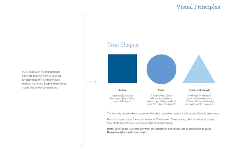

Showed the range.
The guidelines show the same rules working for a conservative business client and an edgy consumer brand, with a real cover marked up as the example.

Gave photography rules a non-photographer can apply.
Human focus, candid, globally representative, shallow depth of field on close-ups, a brand color in frame.

Designed the assets that applied it.
Event banners and the agency’s brand collateral.


Contributed across the effort as associate creative director:
Visual principles, photography direction, color, and page layout on the guidelines document alongside another designer.


RESULTS
A 27-page identity system covering ethos, visual principles, typography, color, photography and logo usage
The agency’s official guidelines, used across a global network of offices
The foundation for the presentation template built from it, which produced 200+ decks
The applied assets: event banners and agency collateral.
Still visibly applied in agency strategy decks and other marketing assets years later
The same discipline on a software brand: guidelines, a sub-brand and templates built for the client’s own team to run.
View FINSYNC Brand and Digital Design